


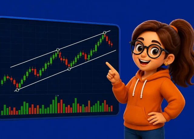
If you’ve ever looked at a trading chart, you’ve probably seen red and green bars moving up and down.
These are called candlestick charts, and they are one of the most important tools in trading.
It is understandable if you don’t know what the hell they are or do. But once you understand how they work, they become one of the easiest ways to read the market.
In this guide, you’ll learn what candlestick charts are, how they work, and why traders use them.
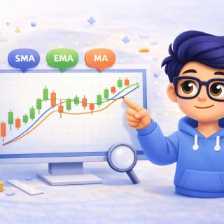
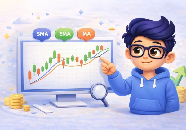
What Is a Candlestick Chart?
A candlestick chart is a way of showing price movement over time.
Each candlestick represents what happened to price during a specific period.
For example:
- 1 minute
- 5 minutes
- 1 hour
- 1 day
This depends on the timeframe you choose on your trading platform.
👉 Learn more about platforms here: MT4, MT5, and TradingView explained
What Does a Candlestick Show?
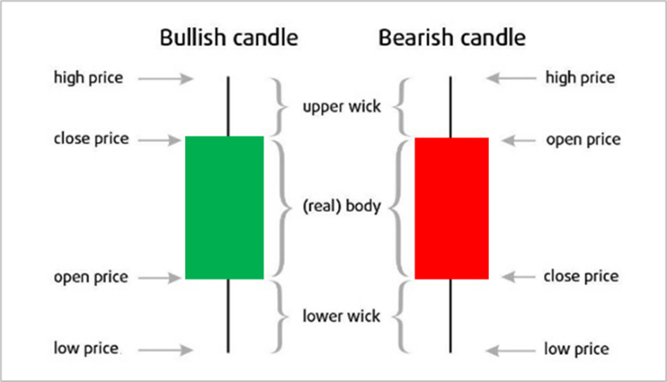
Each candlestick shows four important things:
- Open price – where price started
- Close price – where price ended
- High price – the highest point reached
- Low price – the lowest point reached
This information helps traders understand what happened during that time.
Understanding Bullish and Bearish Candles
Bullish Candlestick (Green)
A bullish candle means price moved up.
The closing price is higher than the opening price.
Bearish Candlestick (Red)
A bearish candle means price moved down.
The closing price is lower than the opening price.
These simple color differences make it easy to quickly understand market direction.
Parts of a Candlestick
A candlestick has two main parts:
1. The Body
The body shows the difference between the open and close price.
2. The Wick (or Shadow)
The wick shows how far price moved beyond the open and close. when a candle opens depending on the timeframe you have on your platform, it dances around a little bit before it settles at the closing price. It might go down and come back up, that is how the wicks are created, The wick shows that the price reached here but it didn’t last.
Long wicks can indicate rejection or strong reactions at certain price levels.
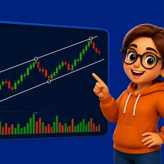
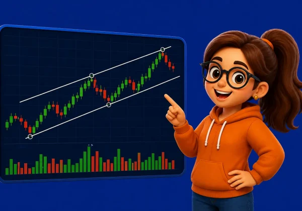
Why Candlestick Charts Are Important
Candlestick charts are important because they give more information than simple line charts.
They help traders:
- understand market behavior
- identify trends
- spot potential reversals
- see buying and selling pressure
This is why they are widely used in technical analysis.
👉 Learn more: What is technical analysis
How Traders Use Candlestick Charts
Traders use candlestick charts to read market behavior.
They look for:
- patterns forming
- price reactions at key levels
- trend direction
Over time, traders begin to recognize certain patterns that repeat.
Common Beginner Mistakes
When starting with candlestick charts, many beginners:
- focus on single candles instead of context
- overcomplicate analysis
- ignore overall market trend
It’s important to remember:
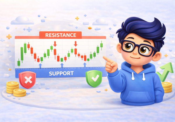
A single candle does not tell the full story, context matters. That is where chart patterns comes in.
How to Start Using Candlestick Charts
If you’re new, start simple:
- learn how candles form
- observe price movement
- practice on a demo account
👉 Learn more: Demo vs Live Trading
Frequently Asked Questions (FAQ)
Are candlestick charts better than line charts?
Yes, because they provide more detailed information about price movement.
Can beginners use candlestick charts?
Yes. Candlestick charts are one of the easiest ways to understand the market visually.
Do candlestick patterns really work?
They can be useful, but they should be used together with other tools and analysis.
Final Thoughts
Candlestick charts are one of the most important tools in trading.
They help you understand what price is doing and how the market behaves.
Once you get comfortable reading them, you’ll find it much easier to analyze trades.
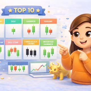
👉 Next: Top 10 Candlestick Patterns Every Beginner Should Know

3 Comments